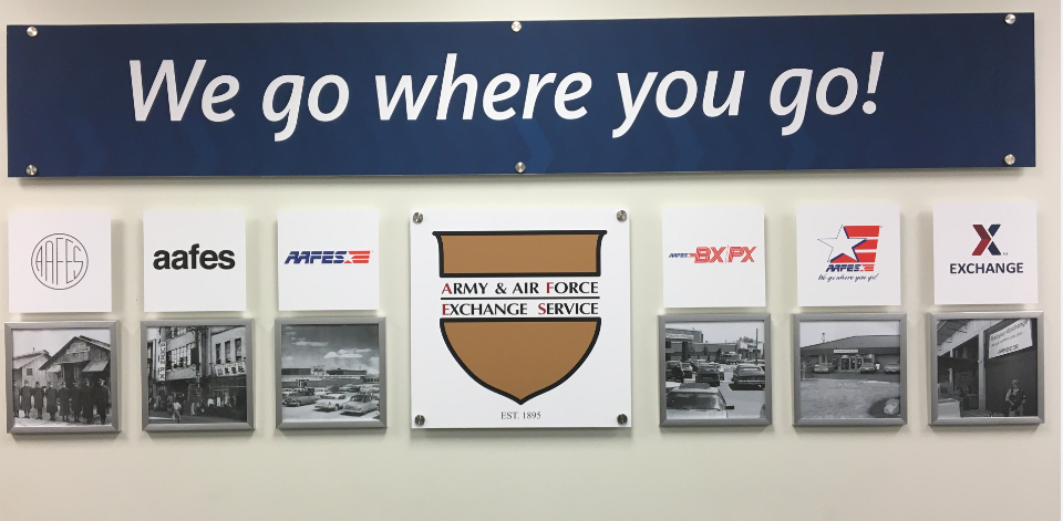
You may have heard this week about a certain social media site’s rebranding, which inspires this look back at the Exchange’s own brand, which debuted nearly 13 years ago.
On Sept. 17, 2010, a 77,000-square-foot main store opened at Tinker Air Force Base in Oklahoma. Customers liked the store’s wide aisles and sleek design, and as they approached, they were greeted by the new corporate logo— red-and-blue chevrons coming together with the word “Exchange” underneath (or in some cases, alongside).
There was also a tag line, “You save, we give back,” emphasizing the Exchange’s competitively low prices and mission to provide dividends to the military’s Quality-of-Life programs.
The logo’s chevrons symbolize the Army and Air Force coming together.
The logo began rolling out to other Exchanges the next year, and was prominently featured in a ShopMyExchange.com redesign in March 2011. The photo at the top of the story shows associates painting the new Exchange logo on a blast wall in 2011 at Camp Buehring, Kuwait.

It also began appearing on Exchange trucks, shopping bags, shopping receipts, name tags and more. The new branding was the result of more than a year of research and work by a team of branding experts and consultants.
“Just like a person’s fingerprint, the Exchange brand identity is unique,” Sandi Lute, then Exchange branding manager and now senior vice president, brand marketing, told the Exchange Post in a September 2010 story previewing the logo’s debut. “The standard elements will create a familiar identity and one that customers recognize and value.”


Leave a Reply